Brand Design and Strategy
Henning Kurz is a Professional Coaching service based in Queensland’s Sunshine Coast. Henning, the sole owner and operator, approached Media Web Online to assist him with building his brand for his established business. We worked together to create the perfect professional logo and an overall brand style
Style Summary and Logo

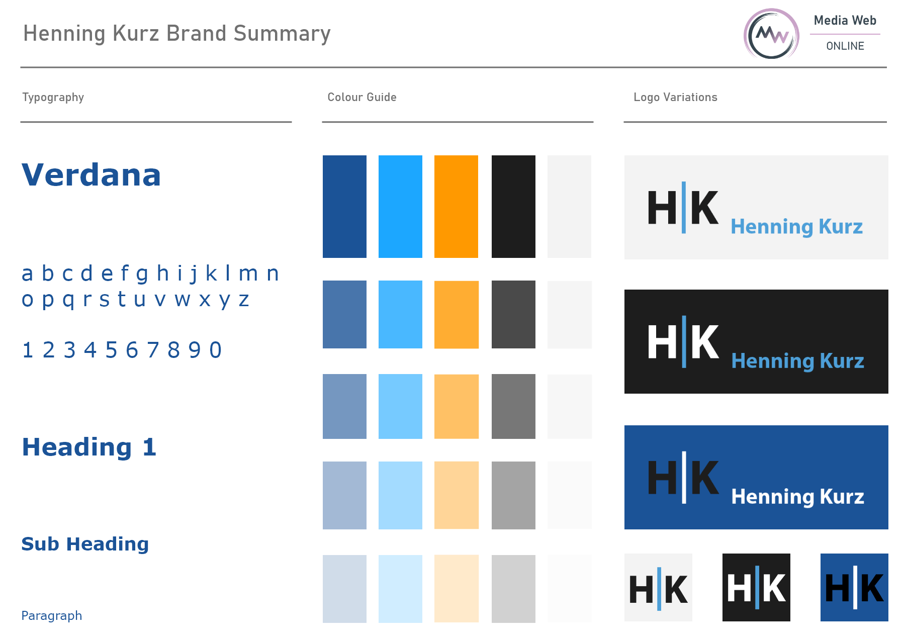
The Brand Style design for Henning Kurz has been designed based on client preference, market research and colour psychology. Verdana is the chosen font because the clean and highly readable nature of this font appeals to a more professional customer group. This font is more likely to capture the gaze of professional white collar customers, which is the client’s primary target market.
The core blue shades have been chosen to portray a calm and focused environment. Blue is often described as the “thinking colour” as it is known to encourage focus and creativity in a professional setting. Blue shades are very popular in professional environments for this reason, so we use complimenting blue shades to draw in professionals that are likely to connect with this colour.
Bright orange has been chosen as a “Call-to-action” colour. The application of this colour will be to confirm contact, to encourage customers to engage in posts, click on buttons and funnel through the sales and development processes. Orange is a highly energetic colour and it has been chosen to encourage customers to move forward through content. The use of orange against a blue shades core palette invokes a feeling of accomplishing goals and breaking down barriers, which happens to be the exact service that Henning Kurz provides.
We created the Henning Kurz logo based on the request of the client to be as deliberate and catching as possible. An initial draft had been presented to us but we took it a few steps further, delivering multiple badge/icon formats, colour variations and a change in text type to go above and beyond simply personalizing the brand.
– This logo is easy to digest and retain due to the direct and clean design.
– It is designed in such a way that the logo can lend itself to display images, business cards and invoice headers seamlessly and without distortion.
– The image design is the initials of Henning Kurz along with a strike line through the middle, extending slightly larger than the letters to represent deliberation and progress.
– Henning Kurz has been supplied with numerous formats and file types to suit all needs.
Within a couple of consultations, Chris helped me gain clarity on my target clientele and their preferences, how to best position myself in my industry and differentiate from my competition. Through a mix of expertise and dedicated research, he managed to create the best possible brand environment to shine light on my business. This included appealing style guides and logos and allows me now to confidently put myself “out there”.
Throughout our collaboration, Chris took the time to understand what I’m looking for, communicated effectively and smoothly and delivered the results I was hoping for on time.
I would recommend working with Chris to anyone that needs support with branding and web-design – his expertise, reliability and ease to work with make it a no-brainer as working with him will get you the actual result you need in a short amount of time.
I certainly will use Chris’ expertise and services in the future and thank him for everything he has done thus far.”

