Brand Design and Stationery
Clean Cut Property Maintenance is a Lawns and Renovations service based in Sydney’s West. Shane Hawkins, the sole owner and operator, approached Media Web Online to assist him with building a brand for his new business venture. We worked together to create the perfect elegant logo, an overall brand style and some stationary designs.
Logo Design
We created the Clean Cut Property Maintenance logo based on a few requested elements. Simplicity, Function, Readability and Symbolism.
– This logo is easy to digest and retain due to the simple and clean design.
– It is designed in such a way that the logo can lend itself to display images, business cards and invoice headers seamlessly and without distortion.
– The image design represents the capital letters in “Clean Cut” and the line slicing through represents the smooth finish of a lawn.
– Clean Cut Property Maintenance has been supplied with numerous formats and styles to suit all needs.
Style Summary
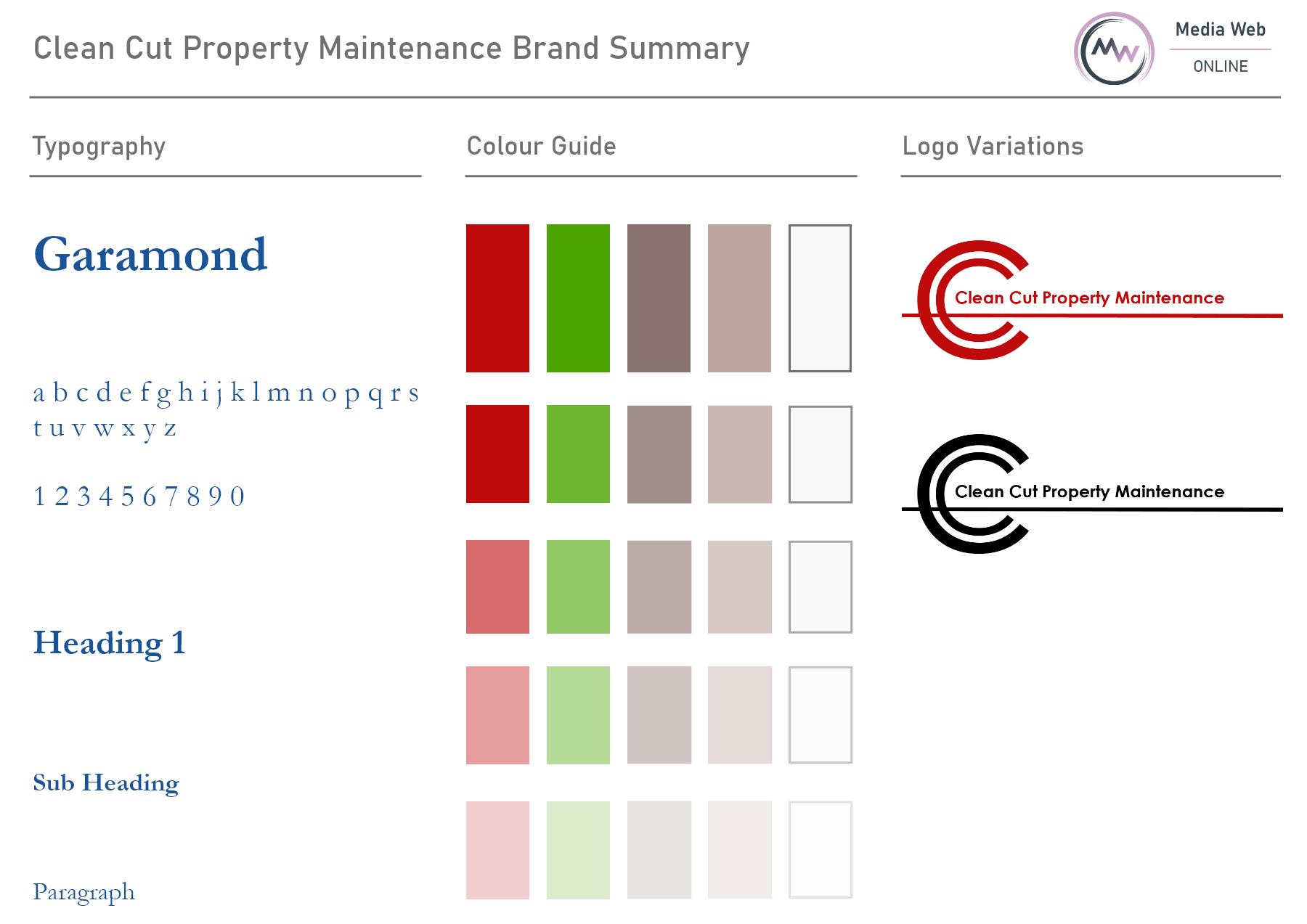
The Brand Style design for Clean Cut Property Maintenance has been generated based on client preferences, market research and colour psychology. Garamond is the chosen font because the client wants to hold the most professional reputation possible. This font is more likely to capture the gaze of commercial clients, which is the client’s primary target market.
The Royal Red feature colour is a client preference, but the remaining core brand colours are based on earthy natural tones. This is to catch the gaze of potential customers, tapping into the reflexive thoughts that they need work done around the home or business.
Business Cards
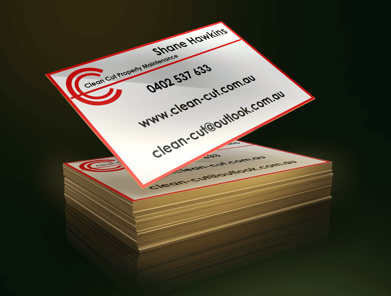

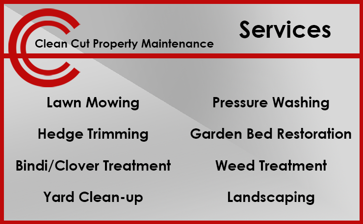
Clean Cut Property Maintenance Business Cards have been designed on the principle of minimalism. They are sleek, simple, elegant and readable. The client requested that relevance be key, so relevance is what we provided.